
This image was shot with a Mamiya RB67, 50mm lens, on Fuji Acros developed in Rodinal. Printed on Ilford MGWT. 16×20″, with Ultrafine Lith developer. Toned with selenium, then partially bleached and redeveloped in variable sepia toner.
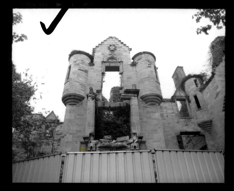
We rented a car in Edinburgh and went off to find this place, in a pretty steady rain. When we got there we were surprised to find it had been boarded and fenced up – it’s obviously a very dangerous place to enter. The rain and cold were really bad; I managed to shoot a roll with my Mrs. holding an umbrella (damn, I have a hell of a wife, doing this crazy stuff with me) when a lady walking a pony appeared and told us it was private property (she was really very nice and I promised to send her a print).
I metered for the shadows and checked the highlights – it was a dull day and there wasn’t much range to the scene, I made a note to develop N+1.
Here’s the contact print of the neg I selected.
I did get a much snappier rendering than the gray day suggested, but very flat as far as much dimension or depth. And it needed a sky. I really loved all the textures and detail, and the neg was contrasty enough that an unsharp mask seemed like something worthwhile.
I made an unsharp mask and also a sky mask; I had shot a lot of skies on the trip and found one that worked well. I started test printing at 5×7 to get a sense of the image.
I also gave it a really solid try as a split-grade print using regular paper developer, but after a few lith prints, I gave that up – that crazy contrast rendering that lith can do brought out all the cracks and textures incredibly well, to where a straight print just looked ho-hum.
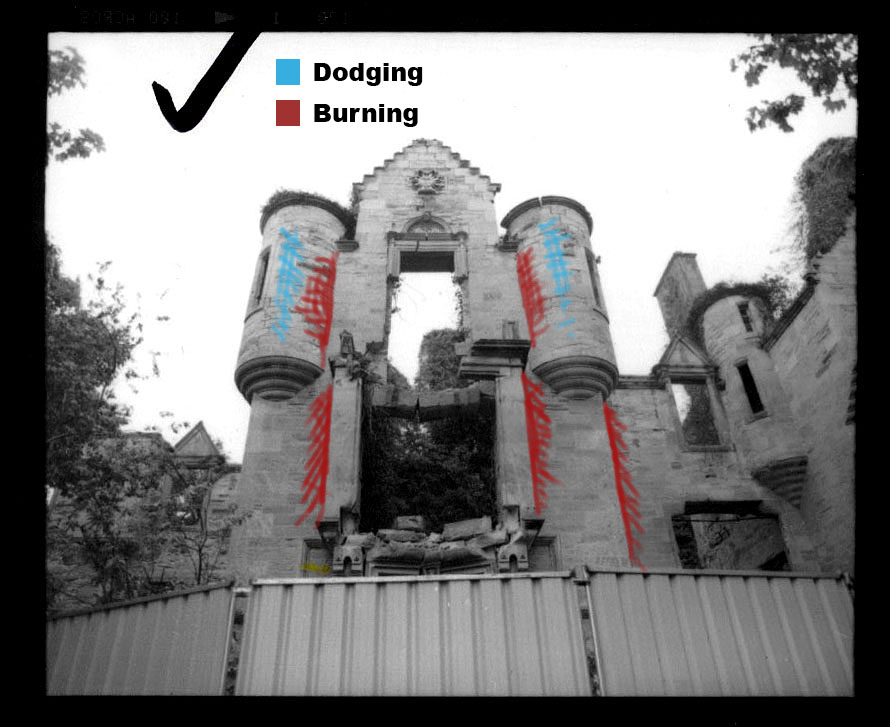
When I moved up to 11×14 test prints, I realized I wanted more depth around the doorway edges, and more of a 3D look to the round towers. I needed burning in that would required masks that were very precise at the hard edges, but could fade softly to no extra exposure, so I made hard masks at the negative plane, and used punched cards held below the lens to control the fade. This required 2 separate masks. Dodging used standard practice, a small bit of card on a wire.
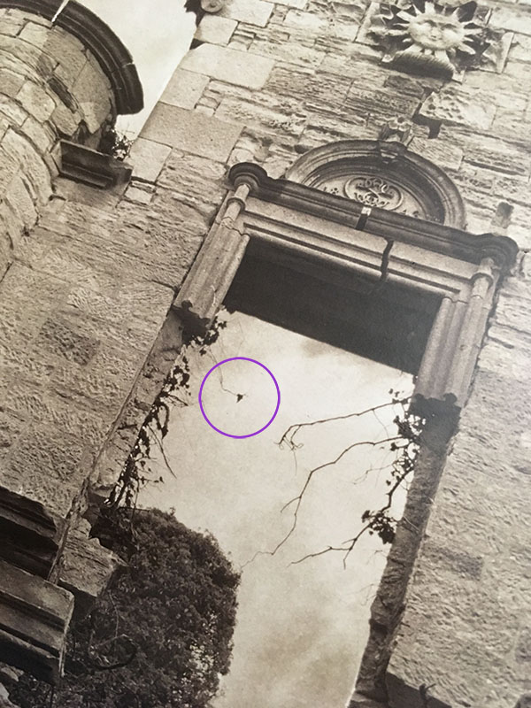
One thing I noticed that wasn’t an issue at 5×7 but was rearing its head at 11×14, and seemed like it would be really distracting on a large print – was this one damn lonely leaf. From a few feet away, it looked like a black spot, a processing error. I addressed this after printing, by using iodine/thio bleach on the dry print, to carefully bleach it out. I used a bamboo cocktail stick, shaved down to a tiny point.
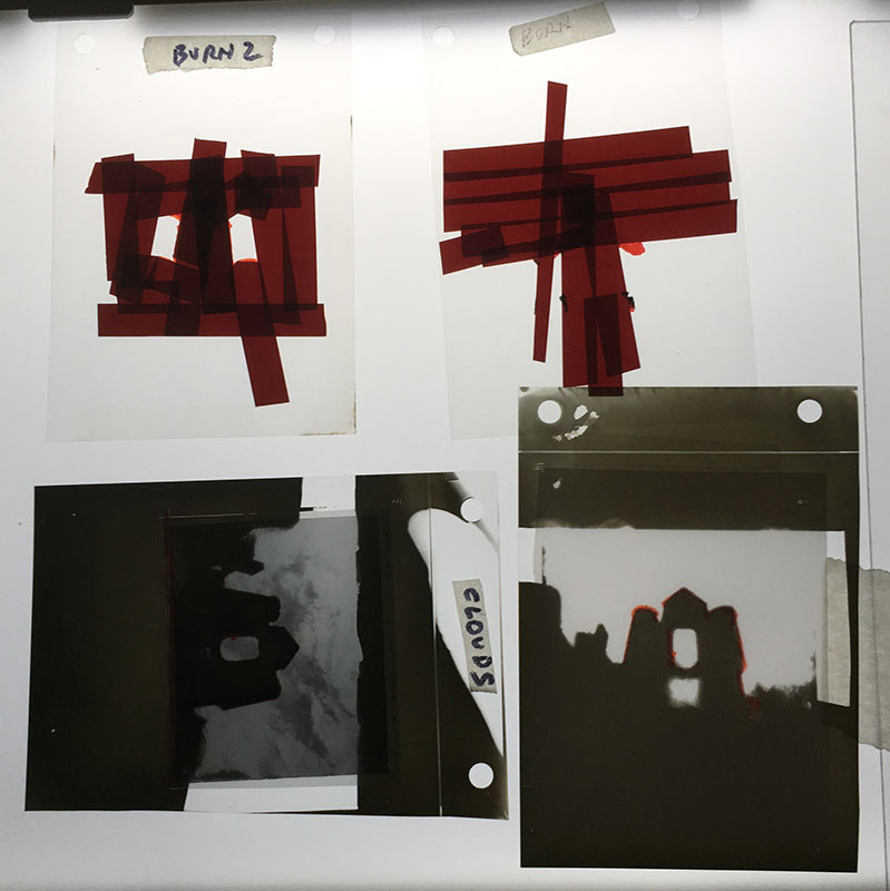
Here are the masks for the sky, the two burns, and also a flashing mask for the sky – the sky required some flashing to hold delicate detail, not enough exposure to fog but just to accelerate the highest tones over the “hump” of inertia. I used a 2-stop piece of ND lighting gel in the filter holder to get consistent exposure.
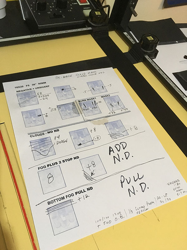
Here’s my final print map – this print required as much standard-everyday dodging and burning as about any print, but getting the masks in the right order takes organization. You almost have to “rehearse” the whole process. The exposure times were LONG since this is a large lith print. Kind of a beat-down. It was also given a late-development flash of 1 second from an overhead tungsten light, when midtones began to establish.
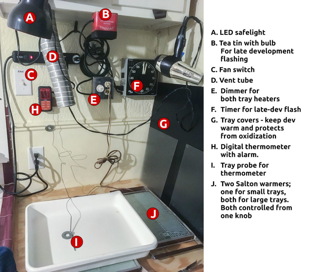
This was printed on Ilford Warmtone fiber in Ultrafine lith developer, 100A+100B+1200 H20 +500 OB, temp about 38°c – my lith printing area has tray warmers, ventilation, thermometers, etc. Image emergence was visible at about 1:30, and overall developing time was about 5-7 minutes. The strength of the developer required a bit of farmer’s reducer to reduce staining and get the borders clean.
The prints were selenium toned for a fairly long time, until I could see density changes in the mids; then bleached in full-strength ferri-bromide bleach, which warms the shadows up – strong bleach does cut selenium’s density a bit and adds warmth. Then redeveloped in variable sepia toner, at the full-red range.
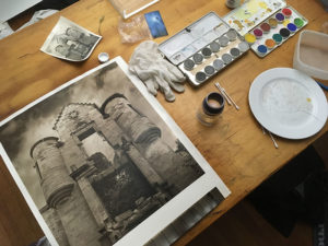
All those masks in a glass carrier did require some spotting, but I enjoy spotting. The tones required more color than standard spotting dyes; I use Grumbacher professional watercolors in a portable kit. These were all gloss prints, so I mixed some gum arabic on my palette (er, old cracked dessert plate). My spotting brushes are priceless; I take a loupe to the art store and look at every #000 brush they have. If I’m lucky, there’s one in stock with a good point.